Citysocial
Product Design / Prototyping

Product Design / Prototyping
UI / Interaction
Competitive Research / Quantitative Usability Research / Prototyping / UI

Note: Much of the project work that I’ve completed is protected by NDAs or not openly available on the web. This is one of those projects. Designs have been altered to hide identifying information.
Entice and reward the Austin happy-hour customer for repeat behavior- like buying drinks, bringing friends, and coming back! Make happsy hour even more fun and even more social.
With a considerate focus on scalability, the stakeholder aims to roll out a city-specific product within 4 months before expanding product offerings and cities.
The developer has experience working with the bootstrap framework.

Feature Prioritization Matrix
I worked with the development team remotely to make a feature prioritization matrix for a first iteration.
This enabled us to focus in on feasibility so that we could test early and often.
We established during these alignment sessions that we have two primary users, the happy-hour socialite who is wondering if the product is going to give them enough perks and the bartender/server who is being asked to test out whether or not the app is worth it for the business (but isn’t as invested themselves).
With these two users in mind, I have to design a transaction with both minimal effort and maximum reward for both parties.
I kept the following user centric questions at the forefront of my mind while designing:
How do I change Arielle’s, the happy hour socialite, habits and keep her engaged
How do I ensure that Devon, the bartender, doesn’t dislike his experience and talk down the app

Using bootstrap
Fewer Cross browser bugs.
A consistent framework that supports major of all browsers and CSS compatibility fixes.
Lightweight and customizable.

designing mid-fidelity cards
Using mid-fidelity cards allowed me to put together the puzzle pieces for a responsive and thoughtful design

User testing plan
Product Roadmap
Site Map
Accessibility Notes
Mobile gestures and micro-interactions
Design for wait times
Error handling messages
Completed actions notifications
Finish up final layout after iterations
Define image and Icon usage
Expand on type and color hierarchy
Craft Micro-copy
Define and design micro-interactions
Define and design transitions
Create a kpi document
Test, learn, design, repeat.


Existing Solution
Go Bambino distinguishes itself from competitors with its non-subscription-based business model and the implicit promise of a hands-off advertisement platform.
The current GoBambino platform requires hands-on involvement from the stakeholder team.


We chose to conduct stakeholder interviews, a parent survey, activity provider interviews, contextual inquiry in activity-provider environments, competitive analysis, heuristic analysis and SME interviews before performing usability tests, in order to become experts in the space ourselves and stay true to our philosophies in UX design.

Dana Serikov, CoFounder and CEO
Stakeholder Goals & Observations
“Providers have gotten tired in the process, they have 20 classes but stop listing after 1 class.”
“We have 50 or so partners. Only 4 or 5 did it themselves. (2 or 3 were so bad I would have rather on-boarded them myself!)”
— Dana, GoBambino CEO

Activity Provider Interviews
Time is the biggest constraint for Activity Providers. They are often running the business by themselves.
Activity Providers are motivated by serving their community.
Activity Providers use Facebook and mommy groups to promote their classes

Parents
Their primary goals are to activate new interests and expose their children to a broad range of activities.
77% of parents surveyed get activity ideas primarily via word of mouth.

Activity Providers
Most activity providers lack a consolidated online presence
Constrained by time and money
1 Kid’s Yoga Studio — Karma Kids Yoga
1 Kid’s Karate Studio — World Seido Karate
6 Failed Attempts
We were only able to reach 2 out of 8 attempted APs in person, revealing that the AP landscape is extremely gated. Our rejections were due to these vendors not having a brick & mortar location (conduct business in a rented, public or shared space), atypical business hours and small staff.
From our research, we discovered that most activity providers are non-loyal members of Kidpass, HiSaywer, Groupon, etc. They will try any platform that is available to market themselves but have not found a catch-all solution for their varied business requirements.

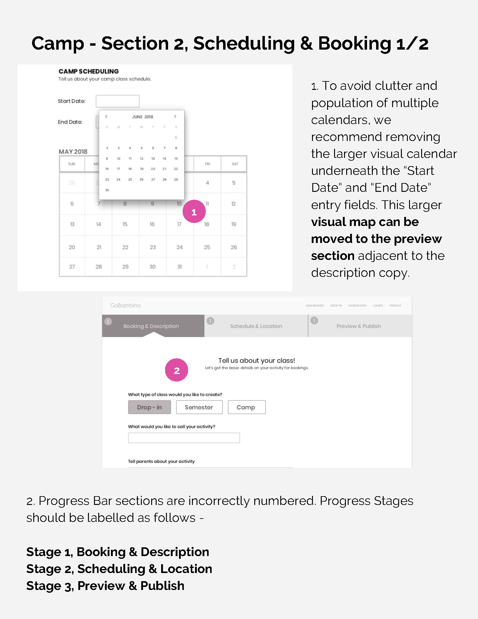
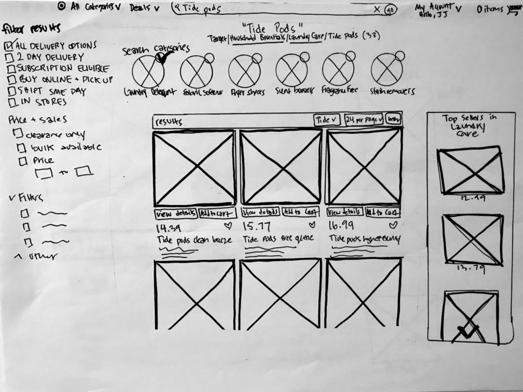
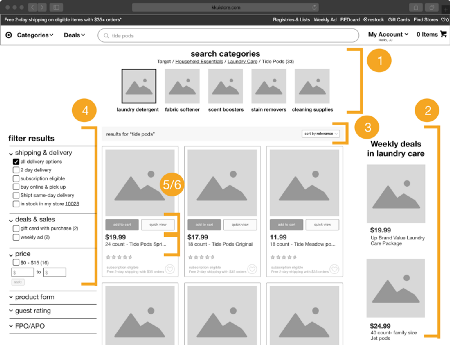
Redesigning the class input "Wizard" was crucial to fixing major usability and abandonment issues. We knew there were problems with the wizard, but wanted to conduct usability tests to abandon all assumptions and let the users speak.

TASK: You would like to post an individual sing-a-long class for kids ages 4-6 that has 10 remaining spots out of 20 total spots. The class is scheduled for next Saturday at May 19th at 9 AM-11AM and costs $40. Create an account on GOBambino under your company name NAME@TEST.COM, pw: test. Create an individual drop-in class listing.

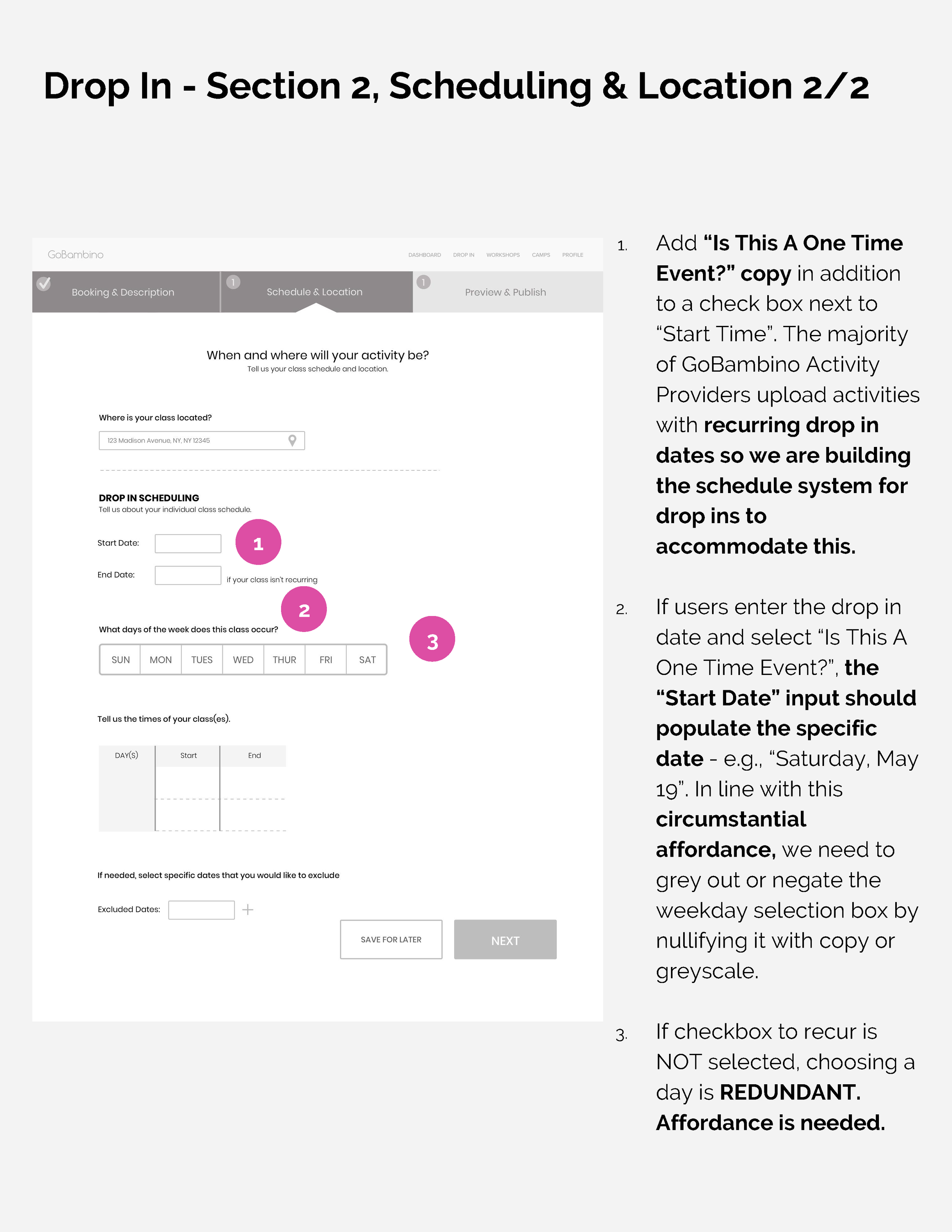
Drop-in listings
took too long to complete and were extremely frustrating to users. Drop-in listings are the most common type of listings on GB.

TASK: Now that your account is all set up you would like to post your summer semester music workshop for ages 8-10 that will start on June 4th and continue till August 1st. The days of the class are Monday and Wednesday afternoons from 2-4PM. There are 10 remaining spots out of 20 and the class costs $800. Complete a workshop listing with this class information.

Semester listings
Had the most issues. Users were extremely frustrated.
Observations & Insights

TASK: Now you would like to post your Christmas Break Music Camp for ages 5-7 that will start on December 17th to December 24th from 10AM to 2PM with a half day on Wednesday, December 19th from 10AM to NOON. There are 10 remaining spots out of 20 and the class costs $400. Complete a camp listing with this class information.

Camp listings
Took less time to complete, but users were mostly just excited to be done with their tasks.
Observations & Insights

The existing website presents activity provider with the prospect of an efficient process; however, the reality is that the activity providers must stick through too many screens, tasks, and actions to finish just one listing, let alone every listing that they would want to post on the platform.


Expected Elements
First-time users responded neutrally to some elements on GoBambino's site.

Unexpected Elements
First-time users responded negatively to perhaps the most crucial forms in the on-boarding process, filling out the class schedules. These schedules allow parents to book the classes.

In order to dive deeper into how we could better serve activity providers, we took a step back as a team and used UX methodology to objectify our research into visual cues that helped us remain grounded in the user.
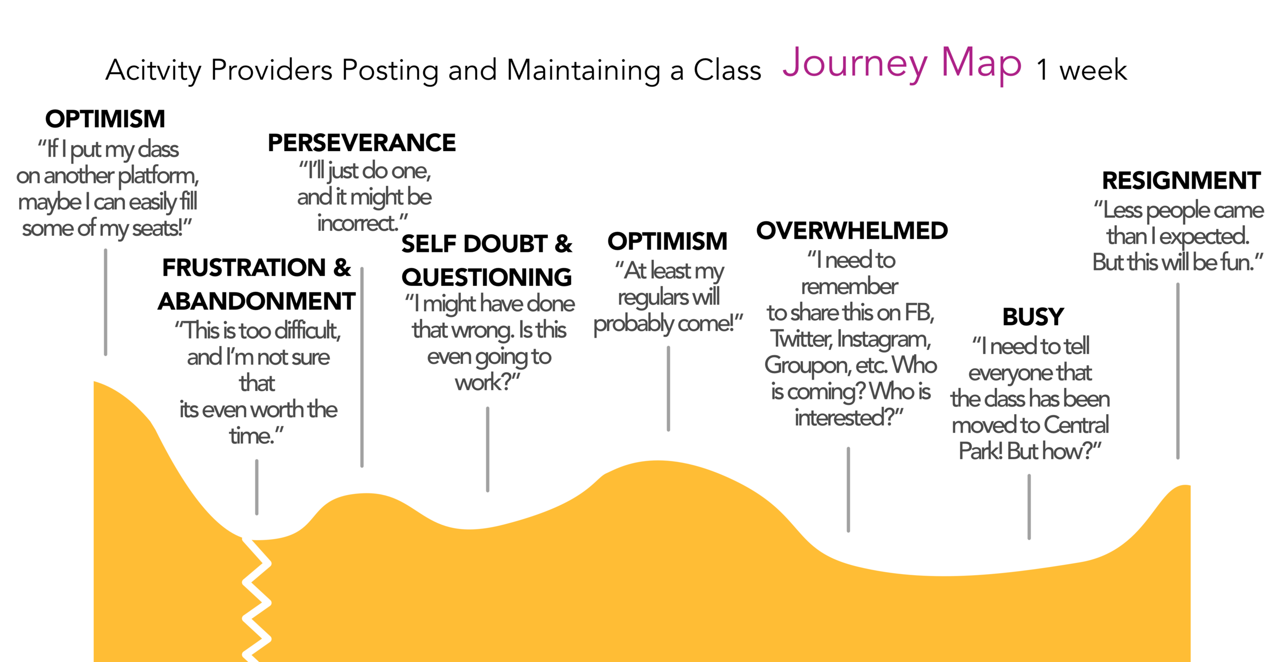
Activity providers face two glaring issues on GB: Abandonment and Value Questioning
Once we fix usability issues, the AP's will still have to persevere through the rest of the journey, questioning the platforms value.

After spending a couple months researching and feeling dissatisfied with the Mommy & Me music classes offered in her neighborhood, Luisa decided to create a music class of her own called Music Maestros. Over the past several months, this passion project, which started off as a casual get together with some of her friends, has grown into a small business of its own, with 3 classes offered on Saturday, a rented rehearsal space, and regular students.
Unsure which activity app will be worth her time investment and fees
Maintaining her class events on Facebook is time-consuming
A quick class listing process
An easy to learn class management dashboard
A way to save and resume the process of listing classes

In order to evaluate the impact of any changes, we let the users guide our choices and continually checked in with the stakeholder.
We conducted 3 rounds of design studio as a team. 1. How do we create implicit and explicit value? 2. How do we streamline the on-boarding process and 3. how do we make on-boarding easier for GOBAMBINO?


During testing we aimed to evaluate:
clarity of copy and terminology by TIMING
learnability and user confidence by LISTENING
ease and intuitiveness of flow by RANKING

Paper Prototyping allowed us to test users' reactions to copy changes and actively listen to their assumptions about autofilling, auto-populating, and saving information.
We continually asked them, "what do you think would happen?" which allowed them to guide our iterations moving forward. We primarily tested copy changes and clarity of information during this iteration; they reacted more positively to this copy, but still hesitated.

In consideration of GoBambino's time and resources, we built a roadmap of the most crucial value additions as well as an informed estimate of how much time it would take.


Winkel’s Goal
The health conscious, busy millennial needs convenient access to reliably high quality locally-farmed produce.
Users have many options to easily and conveniently order dry foods and staples. But fresh produce still seems to require that old school, hands-on approach in order to ensure quality. According to my research, users’ produce buying routines usually include out-of-the-house trips to inspect and choose their produce.
With automation ramping up and consumer expectations steadily (albeit slowly) shifting, consumers are beginning to question the need to disrupt their day with this out of the house, hands-on process.

Value focus- Automatically and visually discouraging add-ons should both lesson the UX load on users and reiterate the value of the product and brand.
Control of Delivery- Users will have an encouraged yet effortless ability to select what they will and won’t get through a familiar process: swiping.
Quality control- Quality through personalization, selection and assurances (in warm and friendly copy) to emotionally mimic the hands-on produce selection process.
Encourage Regularity- Presenting a natural CTA for people to automate this process should provide a data point for indicating trust and building a user base.
Foster pride in being ethically conscious- Gamifying ethics-based challenges down the road can provide feelings of investment and reward in this new process.
Foster feelings of connectedness to source- Ability to get up-to-date news and special stories. Ethics section. Educating articles. Chatbot for conversing with farmers and answering questions. High quality pictures, preferably with people in them as well.
After starting with paper sketches and a Marvel paper prototype, I used user testing results to improve the information architecture of the product and build around existing design patterns.

For the midfi wireframes and invision prototype, I wanted to test user assumptions and basic understanding of the product. I focused on usability and emotional response. I primarily wanted to 1. Observe if the “feed” has a clear perceived purpose and if users respond well to the idea. and 2. Determine if the recipe to basket flow is intuitive enough to proceed with for the next iteration.
Evaluation Tasks / Scenarios
Complete on-boarding experience
Search recommendations for thyme recipes
Choose a lasagna meal and add lasagna ingredients to basket
Choose a different ingredient for the basket than what is offered
Complete Checkout process
These tasks represented the goal to choose a curated recipe from an inspiring selection, make changes that feel appropriate and personal, all while feeling like you are shopping smarter.
This app’s core value proposition directly challenges years of familiar routines. In order to build stickiness and investment during the on-boarding process, I wanted to focus on
1. Creating micro-investments for loss aversion
2. Naturally building a deep understanding of product value
3. Creating the opportunity for a first-glance at the algorithmic and personalized feed
The users’ first interaction is crucial to not only their understanding of the app and its value but also their retention and follow-thru rates. In order to maximize our chances, I built a thoughtful and interactive on-boarding process (albiet friction).
Because of the sprint nature of this assignment, I made some mistakes along the way in order to produce a deliverable!
A research project rooted in music therapy and user interviews


I interviewed 8 people of varying degrees of fluency in music, allowing for the more extreme edge cases (of expert musicians to a self-proclaimed music hater) to inform my research moving forward.
(Its really difficult to find time to exercise an interest in playing music, even if you are already a practiced musician!)
(Why can I not play "phantom of the opera" on the banjo RIGHT NOW?)
(Hypothesis: Do collaborative moments inspire newbies?)
(Karaoke, "Nerding Out" on an album, sounding out beats on a phone, having music stuck in their head, looking for youtube inspiration, spending hours searching for a new "song.")
An edge case informed the design moving forward: a music therapist I interviewed explained that she often leaned on teaching basic tapping and rhythm to some of her handicapped patients. She explained that experiencing even basic rhythm or participating/contributing to it was satisfying and part of what made music different from other artforms.
Looking into music therapy more, I discovered the following:
Although neurobiological mechanisms during active musical experiences have not been studied in depth until recently, some trends are beginning to emerge. Singing is capable of activating portions of the PFC associated with self-referential processing and emotional cognition ( Jeffries et al., 2003 ). Similarly, musical improvisation can activate PFC areas involved in self-reflection, particularly when the improvisation occurs within a familiar musical structure ( Limb & Braun, 2008 ; Liu et al., 2012 ). Neural responses during active music-making may also depend on musical complexity, level of music training, and creativity of the music-maker
I would never have thought to mark an interest in just the most basic of rhythms or beats as a notable behavior. I remembered that another user specifically mentioned that he really had no “ear” for music, but was able to express himself very well through drums. When he didn’t have access to drums, he could tap beats on his phone, electronically.

The constraints in this space of music-learning are obvious and somewhat impenetrable; You need a space to practice, time to practice, something to practice, and occasionally, someone to practice with or teach you.

What started out as “I should make it easier for people to learn music!!!” Actually turned into: I should make it easier for people to play music without fluency in music. I didn’t want to contribute to even more thematic guilt about “not being able to practice more.”

Robbie
The guy working, walking, and living in his headphones.
Robbie has a guitar, but it stays on his wall as art most of the time. He loves music, and often spends hours jamming out, but he never has found a satisfying outlet to really express himself musically.

Moving forward, I wanted to define features directly based from insights and test those features in a paper prototype that really exercised my users' creative sides.


Our Approach
I worked with a team to conduct the research necessary to thoughtfully reconsider Target’s online presence. Our results led us to strive to organically mimic the in-store experience.

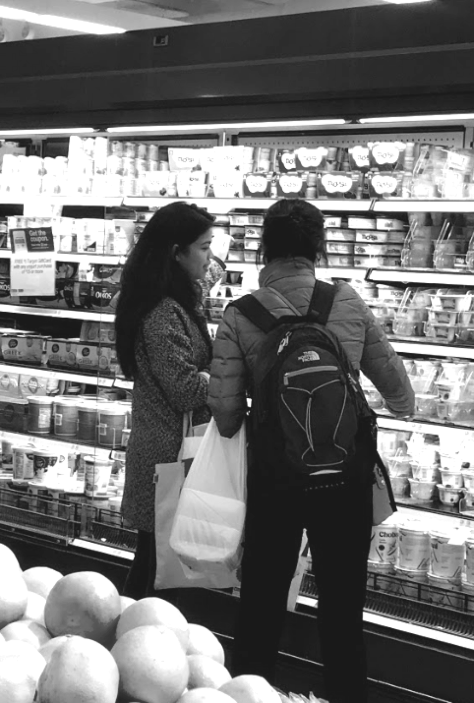
My teammate, Mary, speaking to a customer in a Manhattan target.
We tested 4 users for in-store contextual inquiry; they are frequent shoppers of In-store Target. They range from 26-63 years of age and are all female, as the majority of Target shoppers are female.
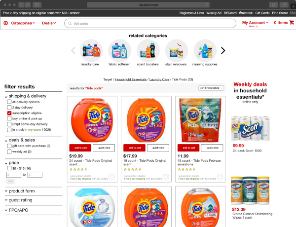
Luckily for the shoppers, the Target in-store experience coordinates well with these behaviors.

Dark Chocolate
Mixed Spring Greens
K-Cups
Bananas
Pita
Celery Sticks
Stacy’s Pita Chips $2.50
Pop Chips $2.50
Chips Ahoy Cookies $2.50
Wheat Thins Cookies $2.50
Peanuts $4.49
Half & Half $3.49
Packaged Carrots $1.89
Mushroom $1.69
Starbuck K-Cup $11.39
Banana (4) $1.00
Pork Chop Meat $4.99
Halo Ice Cream $4.59
Toothbrush $3.32
Up Wipes $1.89
Pet Armour Plus $34.49
Wet Dog Food 1 $4.00
Wet Dog Food 2 $4.00
Mug $5.99
UP Wipes $1.89

Distilling insights from both online and offline usability tests and contextual inquiry yeilded interesting results.


While the user must choose categories that they weren't necessarily expecting, the rest of the screen is faded, leaving little room for visual inspiration comparable to the racetrack.


Users responded really well in hi-fi prototypes. They seemed comfortable with idly browsing at the other visual goodies on the page and even appreciated the reminders.