UI / Interaction
Type: Case Study Timeline: 1 Week
The health conscious, busy millennial needs convenient access to reliably high quality locally-farmed produce.
With a focus on delightful and memorable interactions, I created a Sprint iOS app to ensure a frictionless produce shopping experience.
Understanding
With automation ramping up and consumer expectations steadily (albeit slowly) shifting, consumers are beginning to question the need to disrupt their day with this out of the house, hands-on process.
Users have many options to easily and conveniently order dry foods and staples. But fresh produce still seems to require that old school, hands-on approach in order to ensure quality. According to my research, users’ produce buying routines usually include out-of-the-house trips to inspect and choose their produce.
However, they currently do not trust many current providers to provide the quality that personal visual inspection ensures.
Competitive Space
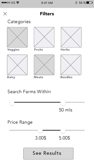
Let’s focus on maximizing value, providing competitive convenience and ease, and allowing for personalization of offerings.
Competitive Analysis led to my product opportunities and ideation guidelines; here are some:
Quality and Control of Delivery
Fostering feelings of connectedness (to source)
Encourage Regularity
Allow for personalization
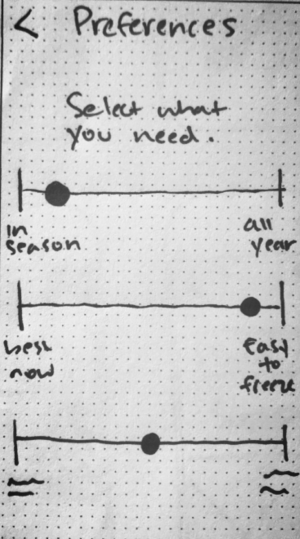
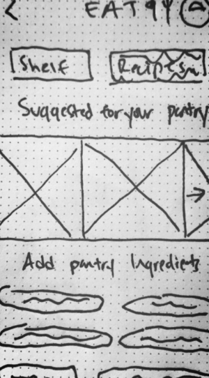
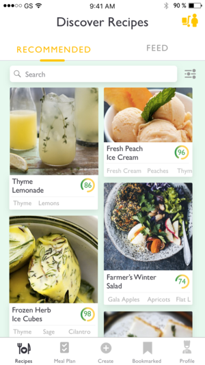
Ability to choose preferences for centralized basket that apply to every order. For each order, recipe/tips “curated for you.” Ability to input your pantry and staples into “Pantry” section that, combined with the fresh produce available, presents you with recipes and tips.
Foster pride in being ethically conscious

Design
After starting with paper sketches and a Marvel paper prototype, I used user testing results to improve the information architecture of the product and build around existing design patterns.
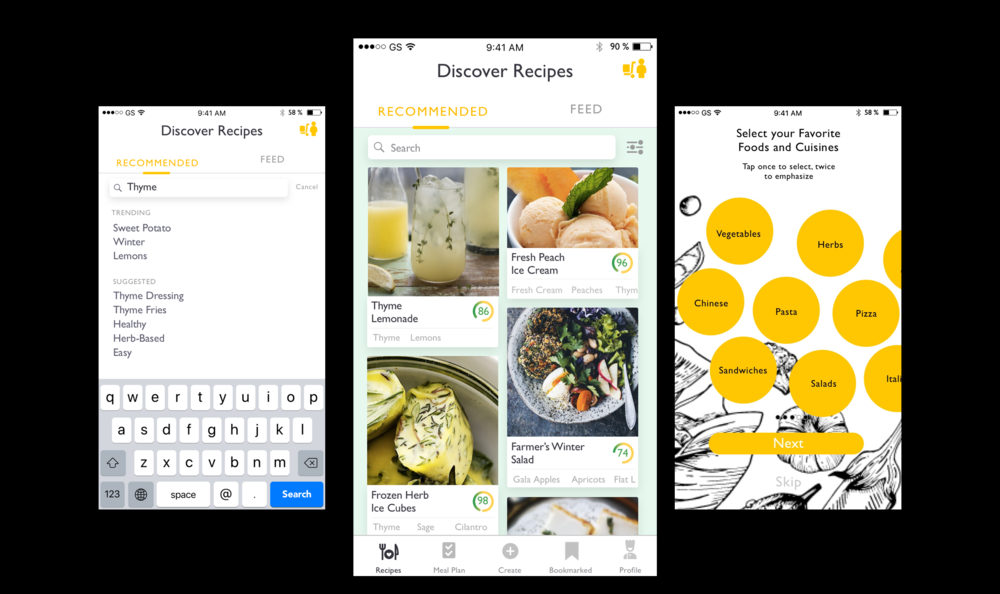
Evaluation Tasks / Scenarios
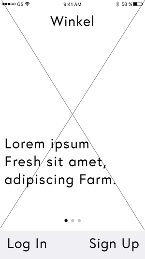
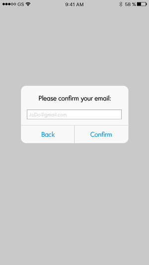
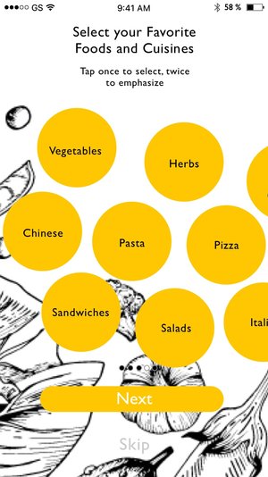
Complete on-boarding experience
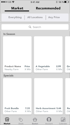
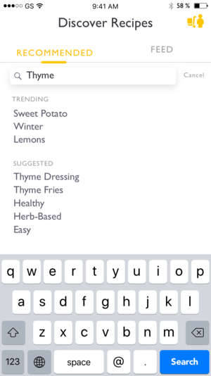
Search recommendations for thyme recipes
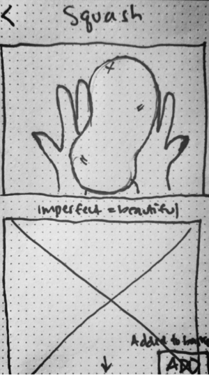
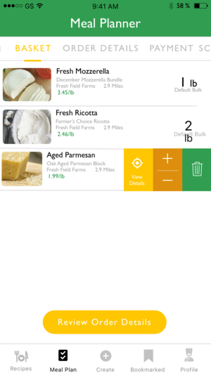
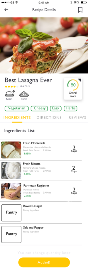
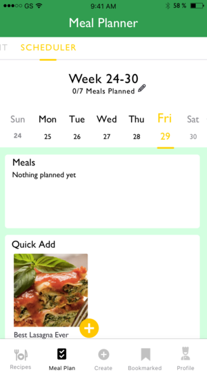
Choose a lasagna meal and add lasagna ingredients to basket
Choose a different ingredient for the basket than what is offered
Complete Checkout process
These tasks represented the goal to choose a curated recipe from an inspiring selection, make changes that feel appropriate and personal, all while feeling like you are shopping smarter.
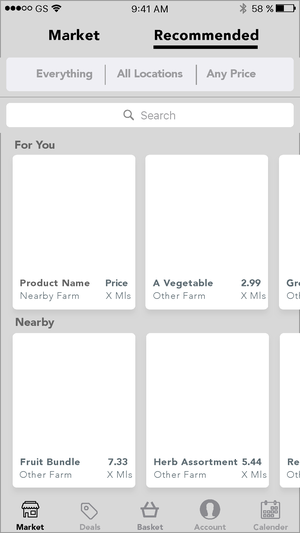
For the midfi wireframes and invision prototype, I wanted to test user assumptions and basic understanding of the product. I focused on usability and emotional response. I primarily wanted to 1. Observe if the “feed” has a clear perceived purpose and if users respond well to the idea. and 2. Determine if the recipe to basket flow is intuitive enough to proceed with for the next iteration.
Screen Progression
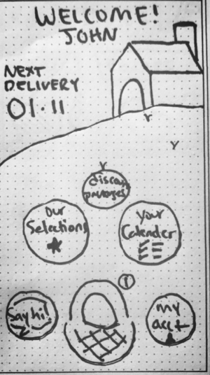
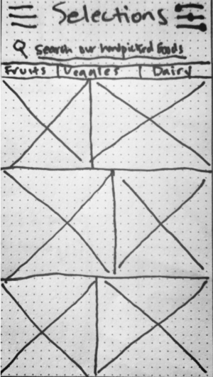


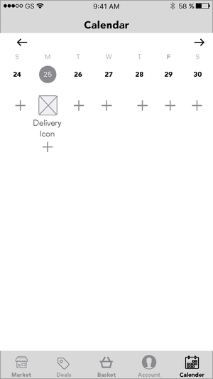
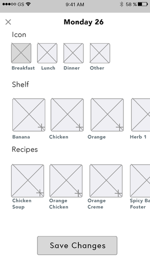
Architectural Developments between iterations:

Next Steps
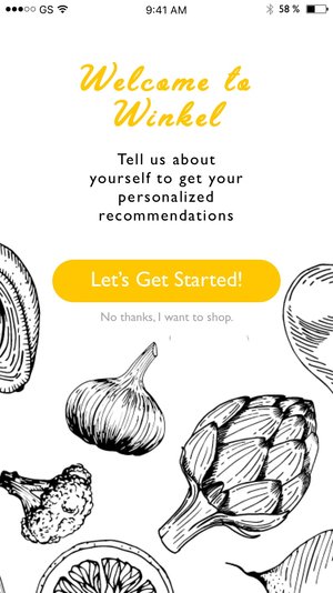
Building Retention with On-boarding Friction
This app’s core value proposition directly challenges years of familiar routines. In order to build stickiness and investment during the on-boarding process, I wanted to focus on
1. Creating micro-investments for loss aversion
2. Naturally building a deep understanding of product value
3. Creating the opportunity for a first-glance at the algorithmic and personalized feed
The users’ first interaction is crucial to not only their understanding of the app and its value but also their retention and follow-thru rates. In order to maximize our chances, I built a thoughtful and interactive on-boarding process (albiet friction).