


UX Tools


In such complicated and expansive e-commerce sites such as Target.com, it is not surprising that users will encounter Information Architecture issues.
It becomes especially important, though, when the successes of the in-store target experience that shoppers have come to associate with the target brand are neither seen nor felt by online shoppers.

Our Approach
I worked with a team to conduct the research necessary to thoughtfully reconsider Target’s online presence. Our results led us to strive to organically mimic the in-store experience.
We started by conducting online and in-store contextual inquiry to observe users' shopping behaviors and seek to understand their motivations when shopping at Target. Doing so allowed us to identify pain points and clashes in expectation and reality that is ultimately detrimental to Target's online business.

The visual target racetrack is not only familiar to regular customers, but encourages a logical flow through the store that users find easy to trust. The racetrack eases the fear/stress of forgetting items, and nudges items that the shopper would be interested in with minimal effort from the shopper herself.
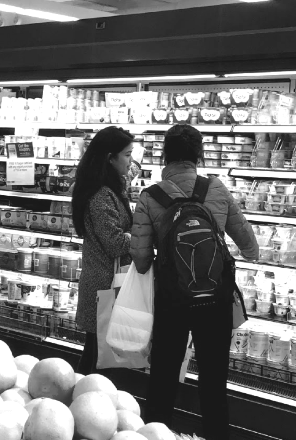
My teammate, Mary, speaking to a customer in a Manhattan target.
We tested 4 users for in-store contextual inquiry; they are frequent shoppers of In-store Target. They range from 26-63 years of age and are all female, as the majority of Target shoppers are female.
The 4 in-store shoppers had certain common behaviors:
1. Buying different items than they had planned (but being happy about it!)
2. Price comparing both within the store and on their phones
3. Planning on browsing sale sections
4. Getting excited about special purchases
5. Preferring familiarity that they have with their favorite Target
Luckily for the shoppers, the Target in-store experience coordinates well with these behaviors.
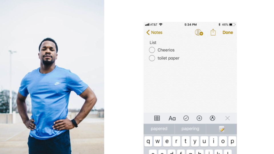
During in-store contextual inquiry, we found that shoppers often approach Target stores with a list, but leave with more (or even completely different) items than they had planned.

“Amys” List:
Dark Chocolate
Mixed Spring Greens
K-Cups
Bananas
Pita
Celery Sticks
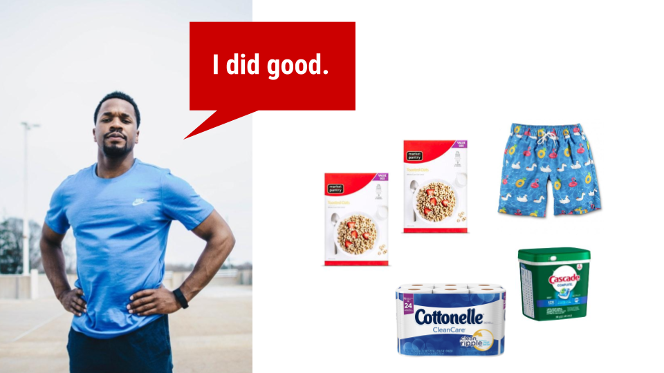
"Amy's" Actual Purchases
Stacy’s Pita Chips $2.50
Pop Chips $2.50
Chips Ahoy Cookies $2.50
Wheat Thins Cookies $2.50
Peanuts $4.49
Half & Half $3.49
Packaged Carrots $1.89
Mushroom $1.69
Starbuck K-Cup $11.39
Banana (4) $1.00
Pork Chop Meat $4.99
Halo Ice Cream $4.59
Toothbrush $3.32
Up Wipes $1.89
Pet Armour Plus $34.49
Wet Dog Food 1 $4.00
Wet Dog Food 2 $4.00
Mug $5.99
UP Wipes $1.89
Amy's transaction receipt totaled at $101.98. But here's the key: she was not just okay with it, but frankly happy with her purchases.

Distilling insights from both online and offline usability tests and contextual inquiry yeilded interesting results.


Directly from users grounded insights, I built JJ the power dad.
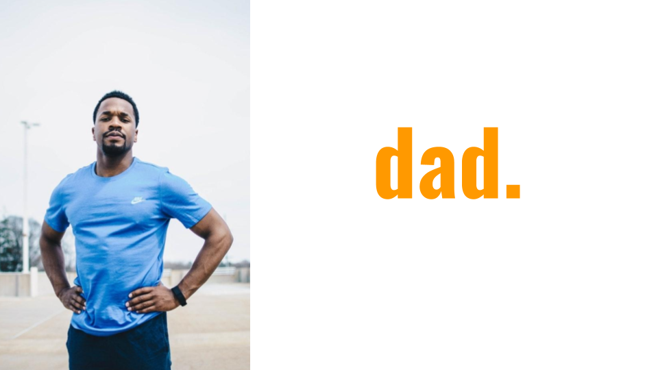

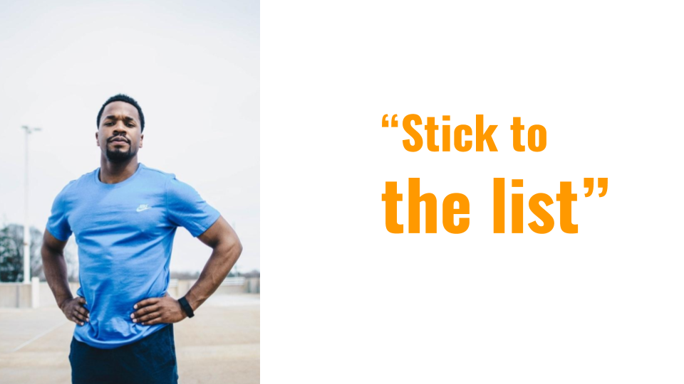

How do we balance JJ's expectations and plans when online shopping (to be economical and smart) with what ACTUALLY makes him happiest about shopping at target in-store (browsing around.)
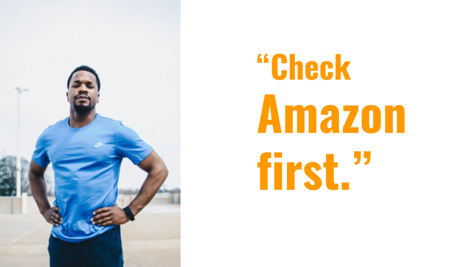
JJ's issues with Target.com

While the user must choose categories that they weren't necessarily expecting, the rest of the screen is faded, leaving little room for visual inspiration comparable to the racetrack.
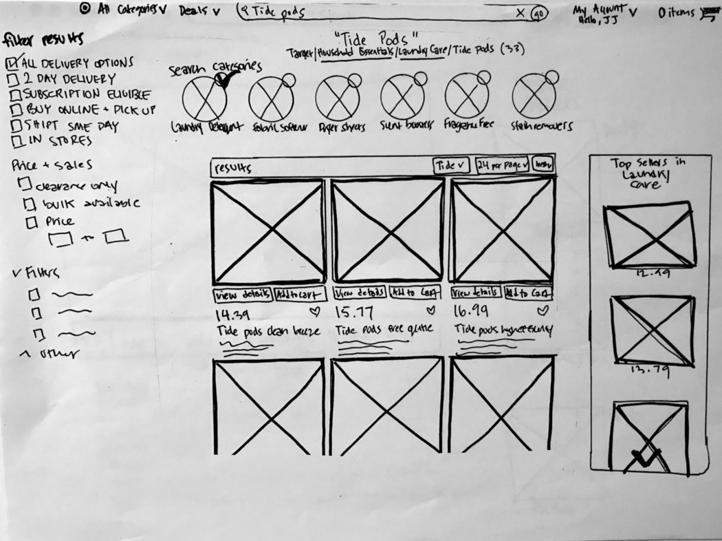
Based upon insights from online usability tests, I devised 4 scenarios that would be likely for JJ in shopping at target.com
1. JJ uses the current Target “categories” dropdown to whittle his way down to a desired item or department. Maybe he ends up spending more time on the website browsing through other interesting items. More likely? He doesn't.
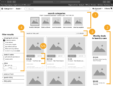
HOW DID I DESIGN > Hoverable categories with visual hierarchy leading shoppers towards “all household essentials" versus specific items. Also, the list ends here; no more 4–5 clicks to get to your desired item. JJ is nudged to a visually appealing page and THEN continues searching for your desired item while looking at other items that might prompt him to remember.

2. JJ searches directly by product name, but ends up buying something that he didn’t intend, yet is happy about.
HOW DID I DESIGN > JJ can search directly by name BUT still see other items that might fit your needs a little bit better.
3. JJ searches by category name and might be prompted to see related items that he might also need.
HOW DID I DESIGN > Searching “laundry detergent” and seeing other related items (through the “also consider” top section.)

4. Doing any of 1–3…and actually buying what you had intended.
HOW DID I DESIGN > Oh, maybe I should also get ____.

The end result? Clickable hifi prototypes that allow users to shop how they want to shop, and end up getting gently nudged towards buying relevant items that they would see in the store.
Users responded really well in hi-fi prototypes. They seemed comfortable with idly browsing at the other visual goodies on the page and even appreciated the reminders.
