Timeline: 6 months + Current Role: Contract Lead UX Designer with Touchlab -> Roll20
Roll20: A flexible, shared virtual tabletop web platform with video, chat and archival game information. Play over 400+ Tabletop and RPG games anywhere and share them with anyone.

What is Roll20?
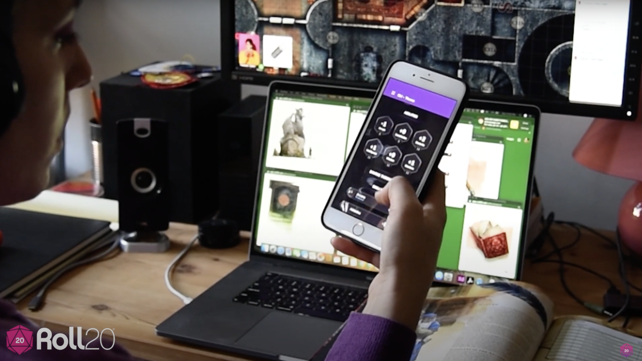
Roll20.net allows users to share a very flexible “virtual tabletop” (seen here) with tokens to represent characters, maps to engage users visually and provide an immersive experience, a chat space, video/audio, and the tools to play a TTRPG like dice, cards and, importantly, connections to licensed content for gameplay.
Its important to note that Roll20 is “game agnostic” by culture. Even though Dungeons and Dragons (5e) is the most popular game, games come and go, as do licenses and partnerships. Roll20 has over 400 games and likes it that way.
TLDR;
After a significant uptick in user acquisition- due in large part to the social ramifications of Covid19- Roll20 needs to retain their old and new users in the extremely competitive “virtual table-top role playing game” (TTRPG) space.
I collaborated with Roll20 stakeholders to create a greenfield iOS and android app for a logical second-screen experience to accompany their flexible web-based platform.
Roll20 had tried to create an app before. It failed with a legacy of one star reviews. The stakes were high.
Leadership in Intake
After extensive research, the Flare founders knew their persona and user better than anyone. The bracelet is designed by survivors of sexual assault and created for men and women who want to “go out,” feel safe, and have an easy out. Their early market is outgoing college students… and their parents.
TLDR; I lead a full-day intake session where we shared information, empathy and goals across companies.
Something incredibly core to the Flare brand is the concept of the Aura. As soon as we connected and before any SOW was signed, they explained the importance of their gradient maps only to just their brand but also their culture; the aura is a modern-day camouflage.
In order to break the ice and demonstrate our understanding of their contextual product, I lead a modern ice-breaker rooted in Art Therapy. Together, we created a collage of colors and feelings to serve as a symbol of our collaboration through the day and our understanding of the contextual nature of this product. The client loved it.

An Example of modern camoflauge in the Flare Aura

Ice Breaking Exercise: Let’s create our team Aura.
Getting Started
Understanding the many hurdles stakeholders had encountered thus far
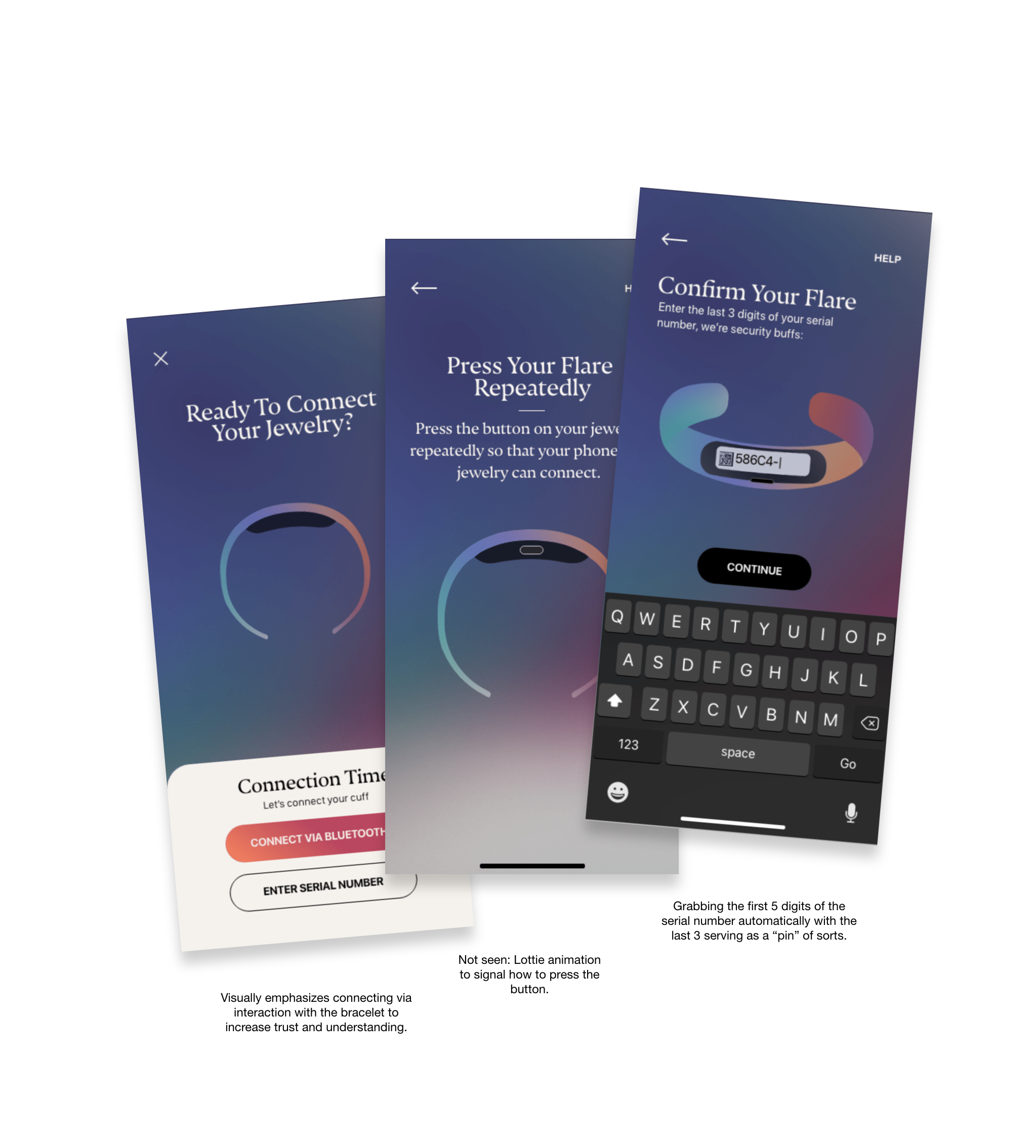
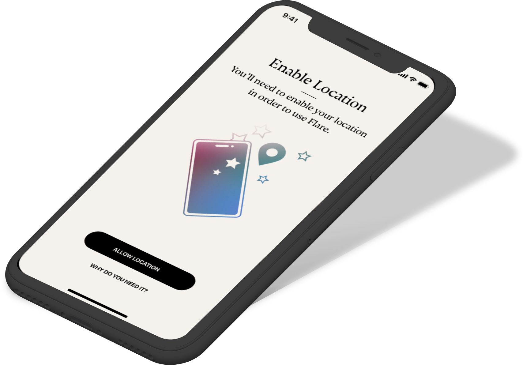
Pairing Flares’ wearable navigation device with the Flare app is thought to be quite simple; The flare bluetooth beacon is consistently signaling, just waiting to be heard.
However, getting the bracelet to work as you expect it to? and NEED it to? Now that’s a much more complicated story; the app . screens given to me were really a story of an unsuccessful, non-iterative 3 year process in an effort to enable the user to use the app by allowing permissions and explaining the features.
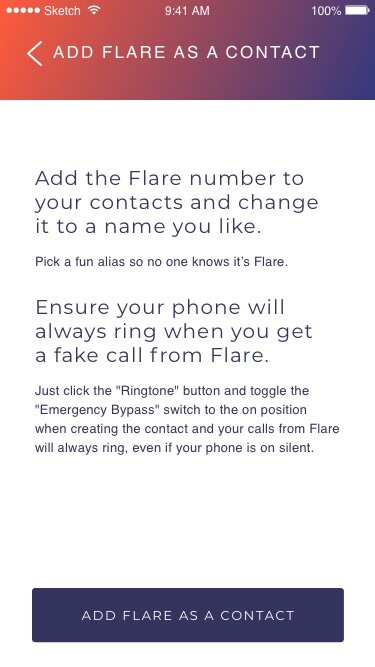
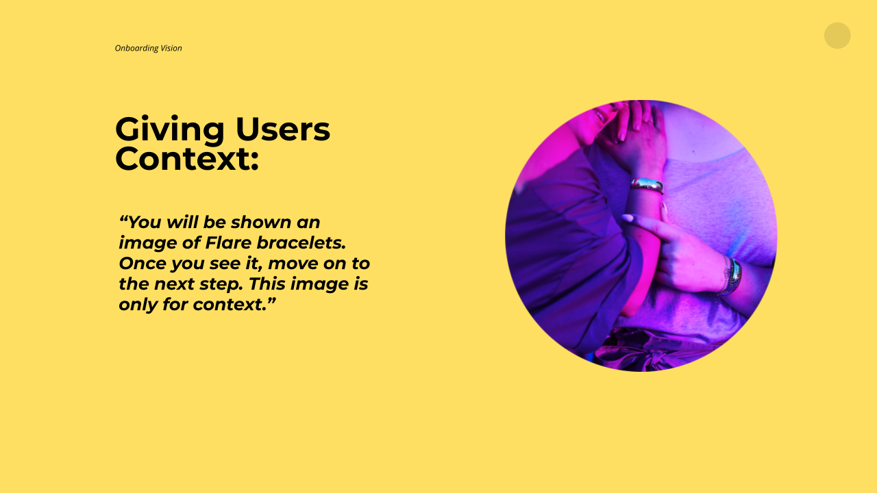
TLDR; The undeveloped app onboarding screens that were handed to me were mostly permission pop-ups paired with lengthy explanations. Users, stakeholders and investors knew this wasn’t the right direction:
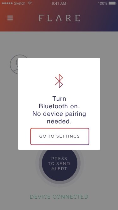
Here are some examples of older designs (created by stakeholders) given to me as a reference. Some hurdles that can be seen here are 1. attempting to control user behavior through lengthy explanation. 2. using jargon too early or too often 3. Using hypotheticals instead of realities because of technical limitations and 4. a misuse of color, spacing and CTA’s that ultimately discouraged good UX.


Getting started: Contextualizing the highly contextual
Stepping into a users’ shoes: Contextualizing the highly contextual
The founders had two main concerns:
1. users wouldn’t jump through all the permission hoops… and therefore not be able to use the product properly and safely (and perhaps not even know that.)
and 2. users would misunderstand the real use cases of the product and use it to get out of a socially awkward situation during which it would be highly preferable to instead show and practice maturity, empathy and social skills.
TLDR; My solution was to contextualize the use of the product and while doing so, carefully place permissions in thoughtful flows where permissions were most likely to be 1. understood and 2. granted with longevity in mind.

So- I used illustrations to generate two game-like “would you rather” scenarios to teach the user about the two IRL options that the bracelet provides you.
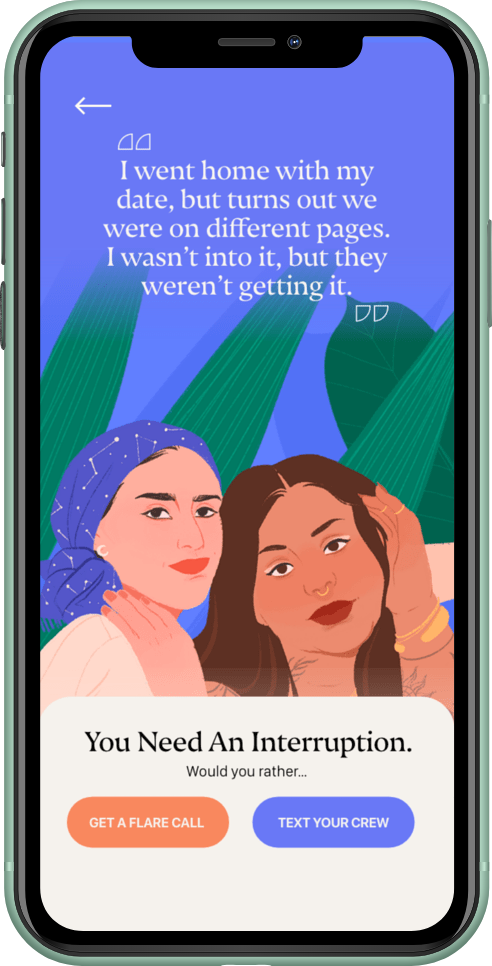
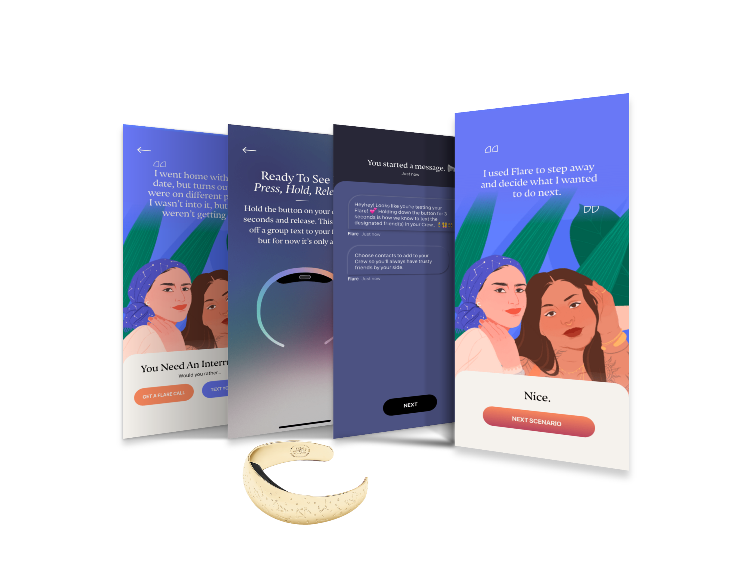
Not only was using the bracelet (for the first time!) contextualized by a relatable scenario, but also the concept of a would-you-rather-scenario is scalable for 1. future product features and 2. social media campaigns.
Testing IRL and Remotely
Testing a connected device poses some hurdles. However, usertesting.com, in-person testing, explicit directions and an iterative process did the trick.
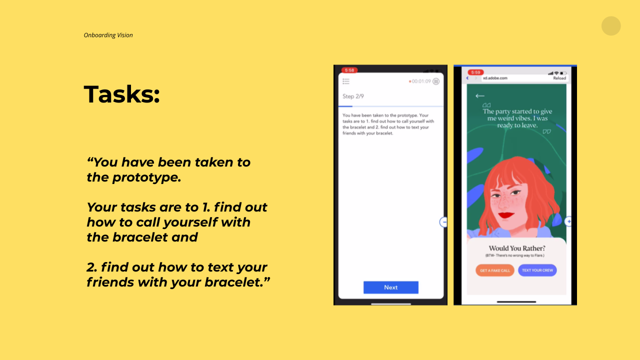
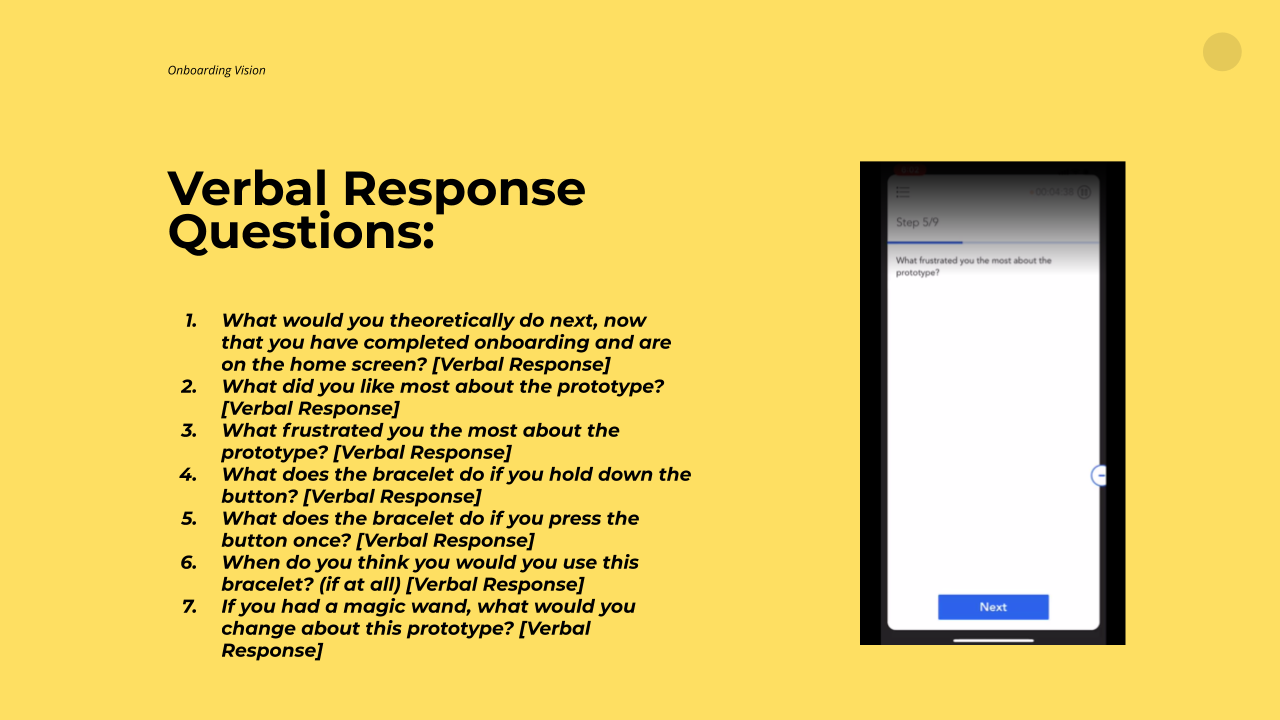
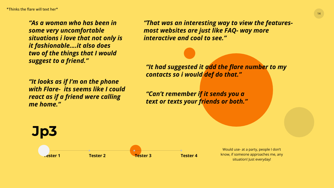
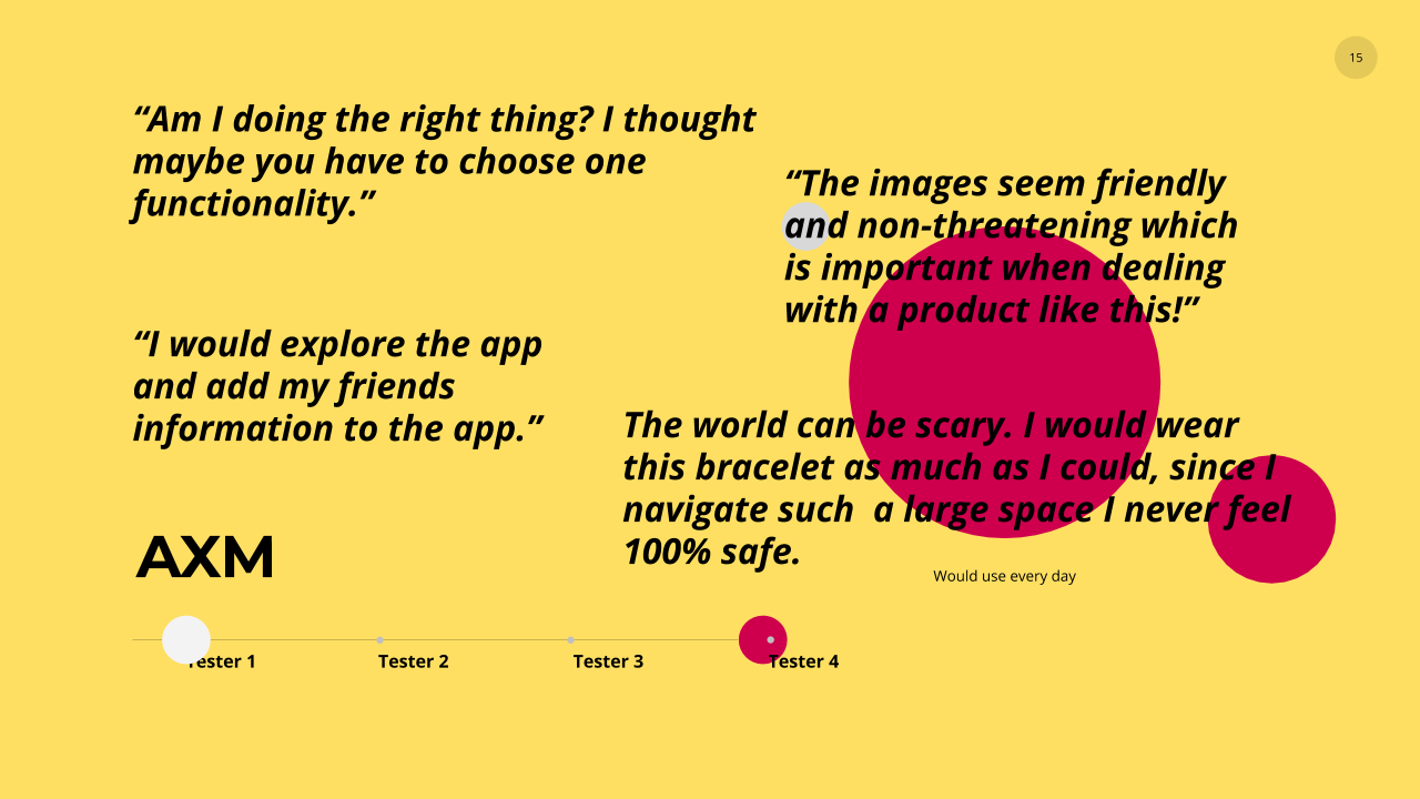
How did I test?
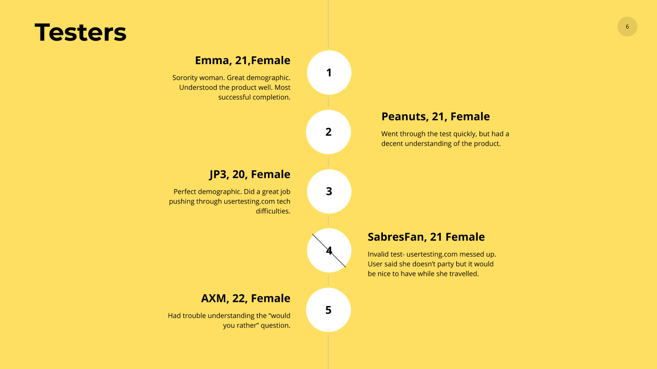
2 Usertesting.com iterations with 5 users each (without bracelet)
1 In-person testing sessions with 4 college women (with bracelet)
Qualitative Beta tester feedback (with bracelet)
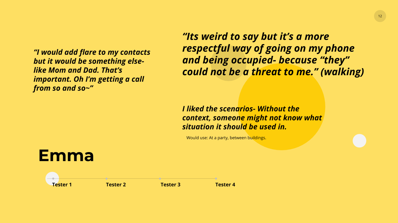
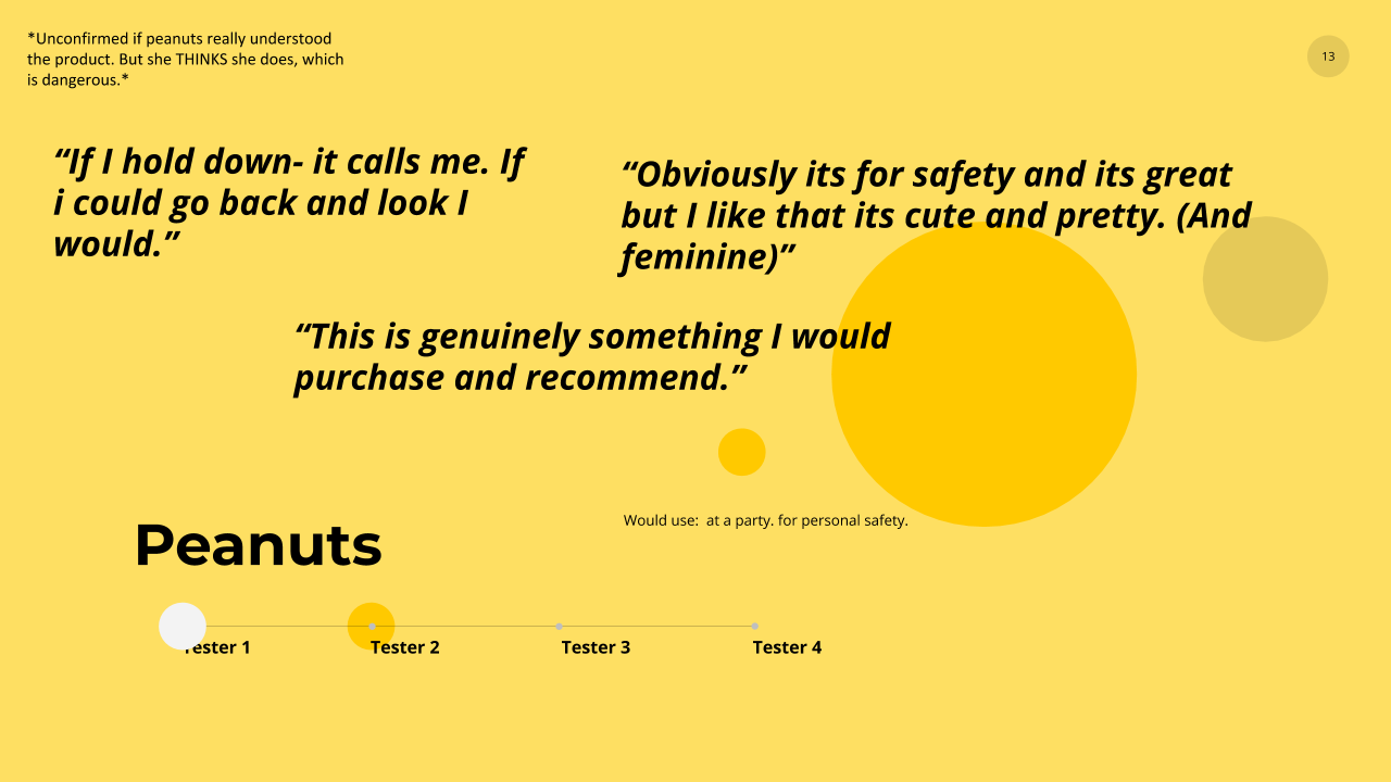
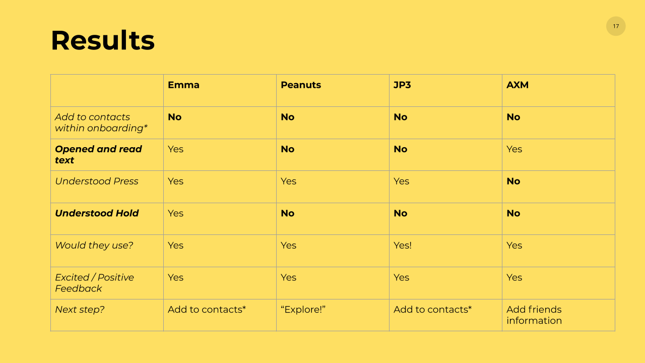
Presenting testing results to the founders proved invaluable to ensure shared understanding of design changes both large and small.
Final testing results directed the following:
Keep the onboarding “soft-land” as more permanent fixture to expose key settings architecture.
Spruce up the settings of the app to give users greater control over notifications and engagement.
Animate the landing page cards in order to create the mental connection of completing a to-do item.
Make screens that explain the “press” and “press and hold” more accessible
Redesign the LOOK of the menu, but keep the architecture the same.