Research / UX / UI / Interaction
Timeline: 2 Weeks Team: Ramon Gamorra, Richie Chen, Caitlin Alyward Product: Case Study Prototype
I collaborated with a team of UX designers—all passionate about transforming Healthcare; together we created MediDoc.
We built for the frazzled and anxious patient who wants to feel more on top of their medical health and life.
The pitch
We’ve uncovered that users are motivated to take greater ownership of their health and more strategic advantage of healthcare services.
Imagine that you are in a doctors office. The doctor asks you, "Any relevant family history I should know?" "Any allergies?" "When was the last time you had a tetanus shot?" "Have you had any surgeries?" "Can you send over that medical history?"
If you are anything like our users, those questions made you sweat.
You feel guilty that you don't know the answers, you feel unequipped for the doctors visit, you noticed the process felt impersonal, and after you leave, you wish you had taken more advantage of your appointment.
Assumption
Having your own, up-to-date medical history is a necessity for quality healthcare and accurate treatment. Individuals and families need a way to consolidate their medical history in a single location.
How might we aggregate personal medical histories in a way that is safely stored, easily accessible and effortlessly shared with professionals of the patient’s choosing?
Understanding
We deliberately combatted our assumptions and bolstered our understanding with interviews of both patients and medical professionals.
From a survey, we found that the majority of millennials that we tested are going to the doctor without a consolidated history, without a strong understanding of their medical health history and without the information that they assumed doctors needed to know.

Patient Reality
We found that patients had a generalized, loose idea of their health and understand the importance of family history, but definitely do not keep a consolidated, detailed, reliable or easily transferrable record of that history.
From surveys, we know that patients lack an understanding of the medical processes in place for transferring and consolidating their records. From interviews, we found the motivation to be more organized.
“Why do doctors still use fax?”
“I wish I had my health information organized—that would make me feel organized”
People seemed to vaguely aim to take more ownership of their health and sometimes made efforts at the doctors’ office that were often unacknowledged and negatively reinforced.
“Sometimes I write stuff down about my grandparents, but they never ask about it.”
“Did they even read my records?”
“Sometimes I bring a hard copy with me, but they’ve never asked for it.”
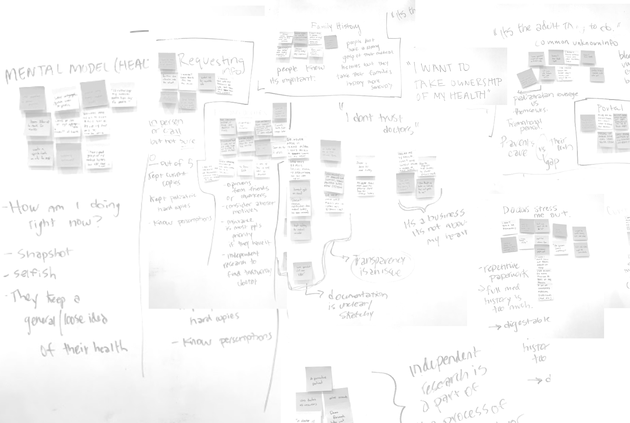
Industry Reality
While we conducted interviews, we researched the industry at a deep level and spoke to medical professionals to help frame the space.
2 of the 3 professionals did not trust their patients at all; these professionals had experience working in lower income communities where observed reading levels were well below the national average.
Selected quotes from medical professionals:
“The patient is usually wrong.”
“The appointment will be over—and then they say- Oh! I have diabetes!”
There is a major disconnect between many patients and doctors and that doctors sometimes feel they must assume that their patients are not organized. How does this effect the quality of our users appointments?
“The patient will say- dont you have that written down?”
Investigating
We cannot satisfy our users with features that are becoming an industry standard. Patients are becoming more and more involved in their healthcare process.
"Patient Involvement" often manifests itself as
painless appointment-scheduling
filtering during online searches
access to provider profiles/reviews and messaging/notification services.
These features live in a more saturated market space and quickly becoming an expectation and norm.
Timeline: 2 weeks Team: Caitlin Alyward, Richie Chen, Ramon Gamorra Blog Post: Link

Competitive and Comparative findings
We cannot satisfy our users with these features alone. The patient is the one constant in a revolving world of different insurances, cities, jobs, and doctors. How do we design for that patient?
Ideating
How do we design to connect our users with their doctors in a way that will not clash with the current formal processes and informal constraints that exist in this space?
We achieved confidence in our design process by surrounding ourselves with our visuals and speaking directly to our patient persona Jaime, not “the user.”
We conducted a Design Studio and went through several rounds of sketches to ensure that we ideated and collaborated on our creative ideas. While many features speak to our users needs, we prioritized features that would allow users to consolidate their medical records and make the process of sharing easier.

We need to communicate to our persona, Jamie, that our product is secure, private and transparent.
We must give him the means to request his medical and health records, safely store those records, transfer when appropriate and share those records in-person.
Usability
By completing 3 rounds of usability tests with 3 levels of fidelity, we ironed out usability issues and let the users guide any changes.
(Our method of approach in remaining grounded in user empathy was to write quotes next to screens during collaborative iteration sessions.)
Some key testing session implicit and explicit takeaways:
Users responded very positive to the required “double” confirmation in our app. Users want double-confirmation that they’re transferring the correct documents and even more explicit confirmation along the way. Users questioned the security of the app, partly due to fidelity.
Users don’t want any personal health information in notifications or on their home screen of the app.
Users prefer more formal language (i.e. “transfer” vs. “share”) and want the entire process to be very professional and official.
Users want clarification on what HIPAA is and why they need to sign permission to receive their own documents
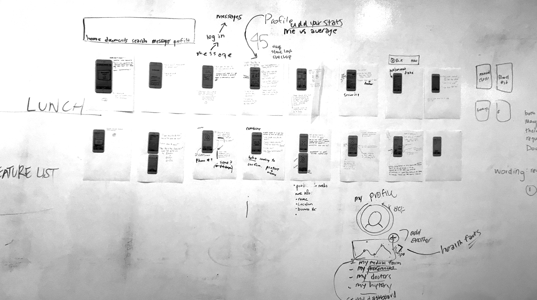
Screen Progression


Final Prototype
My team shipped an ambitious product to stakeholders in less than two weeks by maintaining user-centric empathy, deliberately working to remain aligned, and communicating our research and insights.
After 3 rounds we were happy to achieve: 2.8 point rating increase; 10 minute decrease in time spent to complete all tasks; 100% success rate; an overall enthusiastic response

Next Steps:
Users questioned the success of their tasks; they were not given the correct confirmations or cues.
Remaining aspects to address include high-fidelity changes, including graphics
Users disliked some copy choices calling it “cheesy,” as well as some of the stock photos that we used.