
MediDoc UX Toolkit:


Users are motivated to take ownership of their health and greater advantage of their healthcare.
Imagine that you are in a doctors office. The doctor asks you, "Any relevant family history I should know?" "Any allergies?" "When was the last time you had a tetanus shot?" "Have you had any surgeries?" "Can you send over that medical history?"

You feel guilty that you don't know the answers, you feel unequipped for the doctors visit, you noticed the process felt impersonal, and after you leave, you wish you had taken more advantage of your appointment.
Hypothesis problem statement:
Having your own, up-to-date medical history is a necessity for quality healthcare and accurate treatment. Individuals and families need a way to consolidate their medical history in a single location. How might we aggregate personal medical histories in a way that is safely stored, easily accessible and effortlessly shared with professionals of the patient’s choosing?
Empathizing and Hypothesizing
We deliberately combatted our assumptions and hypothesis with an extensive survey that helped frame questions for our interviews.
Key survey findings:

Do you know how to share you medical records with a new doctor?
People guessed that they would call the doctors office or bring a paper version.

Do you have a consolidated medical history?
People who did counted their pediatrician notes.

Do you know your vaccine history and if it is up-to-date?

Do you use any apps or websites to track your medical history?
People who did used insurance websites.

The last time you went to a doctor, do you feel like they understood/knew your medical history?
We definitely wanted to dive deeper into this in interviews.
From the survey, we found that the majority of these millennials that we tested are going to the doctor without a consolidated history, without a strong understanding of their medical health history and without the information that they assumed doctors needed to know.
Headed into interviews, I wanted to actively listen to uncover any patients' possible underlying motivations to share medical records, and to chase inquiry about any behaviors stemming from those motivations.
Interviewing Patients:

2. Considering the context
While we conducted interviews, we researched the industry at a deep level and spoke to medical professionals to help frame the space. User-centered design should still always consider the competitive and contextual landscape.
Interviewing Doctors:

2 of the 3 professionals did not trust their patients at all; these professionals had experience working in lower income communities where observed reading levels were well below the national average. The primary insight from our SME interviews is that there is a major disconnect between many patients and doctors and that doctors sometimes have to assume that their patients are not organized.
How does this effect the quality of our users appointments?
How do we connect our users with their doctors in a way that will not clash with the current formal and informal processes set in place?
Competitive Analysis:

There is an industry trend to facilitate more patient involvement in decision-making to ease obvious frustrations with the system.
"Patient Involvement" often manifests itself as
painless appointment-scheduling
filtering during online searches
access to provider profiles/reviews and messaging/notification services.
These features live in a more saturated market space and quickly becoming an expectation and norm. We cannot satisfy our users with these features alone. The patient is the ONE constant in a revolving world of different insurances, cities, jobs, and doctors. How do we design for that patient?
3. Distilling Insights
We uncovered insights from our user-based research to reveal humanized areas of opportunity for MediDoc.
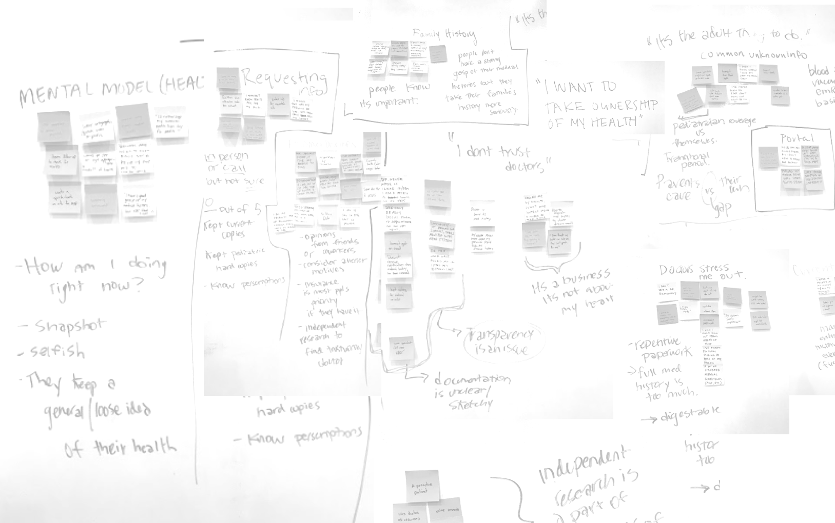
My team worked together to affinity map and synthesize quotes, observed behaviors, and implicit meaning into different groups of insights. To my group, this meant keeping quotes intact and distilling meaning from those quotes. Because our pool of patients was quite small, we were able to get to know those interviews intimately and dive deeper into insights together.
Findings:
People had a general, loose idea of their health, but not necessarily a consolidated, detailed, reliable or transferrable one.
People wanted to take more ownership of their health and made some efforts already
There is a general distrust of doctors; people often do independent research to make up for it.
Going to the doctor is stressful sometimes, and often impersonal. Patients appreciate doctors who remember them, but don't see a difference in quality of care.
If its inconvenient or too much work to be organized and on top of things, patients probably wont do it.
The Existing Ups and Downs:

5. Designing for Our Persona and Feasibility
We achieved confidence in our design process by surrounding ourselves with our visuals and speaking directly to Jaime, not “the user.”

We conducted a Design Studio and went through several rounds of sketches to ensure that we ideated and collaborated on our creative ideas
While many features speak to our users needs, we prioritized features that would allow users to consolidate their medical records and make the process of sharing easier.
Testing and Iterating
By completing 3 rounds of usability tests on 3 levels of fidelity, we ironed out usability issues and let the users guide any changes.
Iteration Progression:

The security aspect of our app was hugely important to users; they wanted to feel assured that the app was safe and that this process was official.
Paper Prototype Usability Testing

4 Participants; 3 Tasks Each
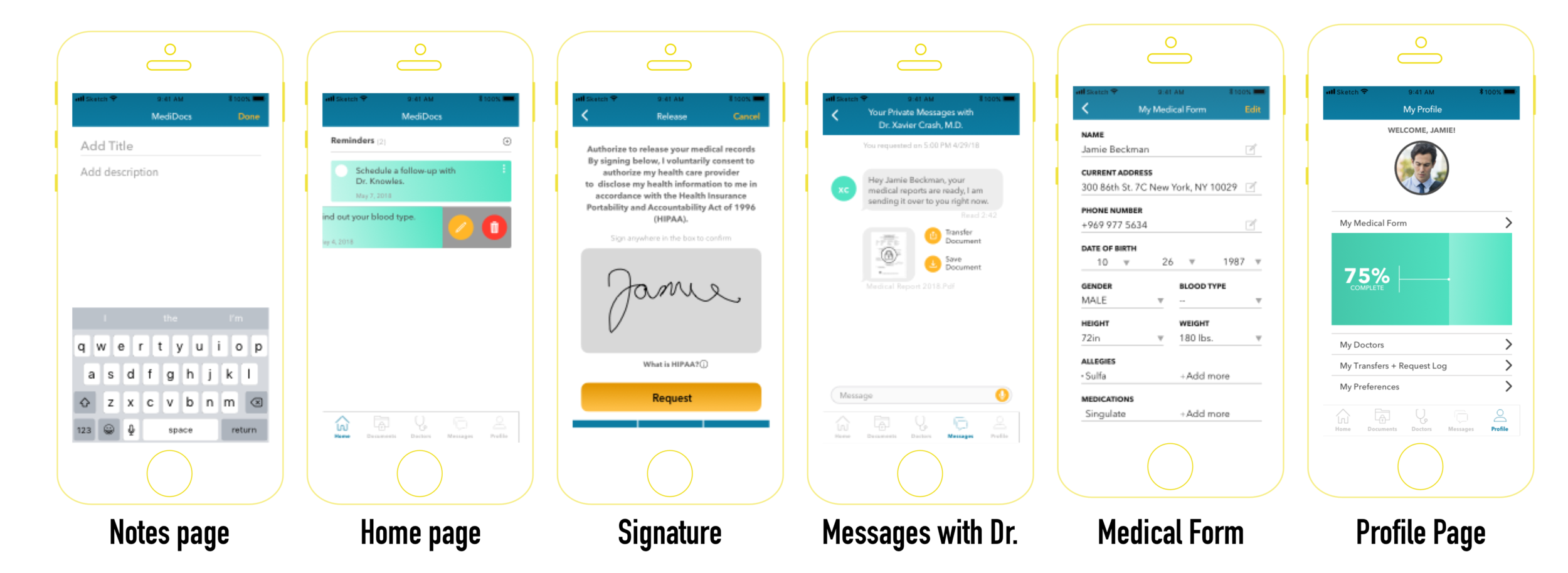
Task 1. Request your medical records from a previous doctor that you have seen one time.
Task 2. View and Save those medical records to the cloud.
Task 3. Transfer those medical records to your new doctor - during your appointment.

Takeaways
Users want to organize documents by Doctor name and date of appointment
Users don’t want any personal health information in notifications or on their home screen of the app.
Users prefer more formal language (i.e. “transfer” vs. “share”) and want the entire process to be very professional and official.
Users questioned the success of their tasks; they were not given the correct confirmations or cues.
MidFi Prototype Usability Testing

4 Participants; 4 Tasks Each
Task 1. Request your medical records from a previous doctor that you have seen one time.
Task 2. View and save those medical records to the cloud.
Task 3. Transfer those medical records to your new doctor before your appointment.
**Task 4. Add your blood type to your medical form after your doctor tells you what it is.

Takeaways
Users expected there to be multiple paths during their tasks and even tested those paths themselves.
Users want clarification on what HIPAA is and why they need to sign permission to receive their own documents
Users responded very positive to the required “double” confirmation in our app. Users want double-confirmation that they’re transferring the correct documents and even more explicit confirmation along the way.
Users were confused by icon choices. Symbols indicating actions of transferring, for example, are too vague. Icons — especially the search for Doctors icon — needs to be more representative at a quick glance.
Users responded neutrally or negatively to the homepage infographic, leading us to scrap it.
Users questioned the security of the app, partly due to fidelity.
Hifi Prototype Usability Testing
4 Participants; 4 Tasks Each
Task 1. Request your medical records from a previous doctor that you have seen one time.
Task 2. View and save those medical records.
Task 3. Transfer those medical records to your new doctor before your appointment.
Task 4. Add your blood type to your medical form after your doctor tells you what it is.

Takeaways
Fidelity increased participants confidence in the safety of the app
On average, repeat testers completed the task in less time and commented with more positive feedback
New participants didn’t encounter same issues as participants in the previous round of tests
Remaining aspects to address include high-fidelity changes, including graphics
Users disliked some copy choices calling it “cheesy,” as well as some of the stock photos that we used.
Final Clickable Prototype:

After 4 iterations and 3 rounds of usability tests, we succeeded in shipping an ambitious prototype to stakeholders by maintaining user-centric empathy, deliberately working to remain aligned, and communicating our research and insights.